Advanced plotting based on Pylab and Matplotlib has been available in NCLab since long time ago, but it was never really exposed to the user (this is a generic problem we have and we are gradually improving it). The new module makes it possible to plot polylines, polygons, functions of one and two variables, planar and 3D curves, and more. The present worksheet shows how to plot polylines, polygons, functions of one variable and planar curves. What we present here is a rather small portion of the functionality of these libraries. For more detailed overview see Chapter 4 (pages 23 – 45) in the NCLab Python Textbook. There you will also learn how to plot functions of two variables, curves in the 3D space and more. Complete functionality of the module for experts can be found in the official Pylab and Matplotlib tutorials on the web.
Few simple rules to remember
- Commands are typed into input cells. Input cells are evaluated by pressing the green button under the cell.
- Pressing the green button in the upper menu will evaluate all input cells in the worksheet.
- An image can be removed by pressing the Delete button under it.
Plotting Polylines
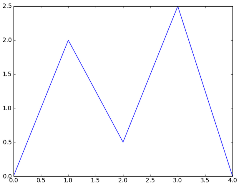
Let us begin with drawing a polyline consisting of five points [0, 0], [1, 2], [2, 0.5], [3, 2.5], [4, 0]:
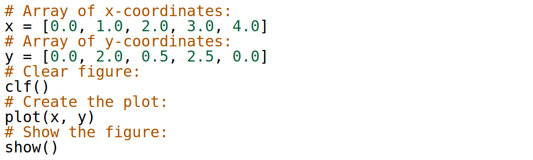
Output:
Plotting Polygons
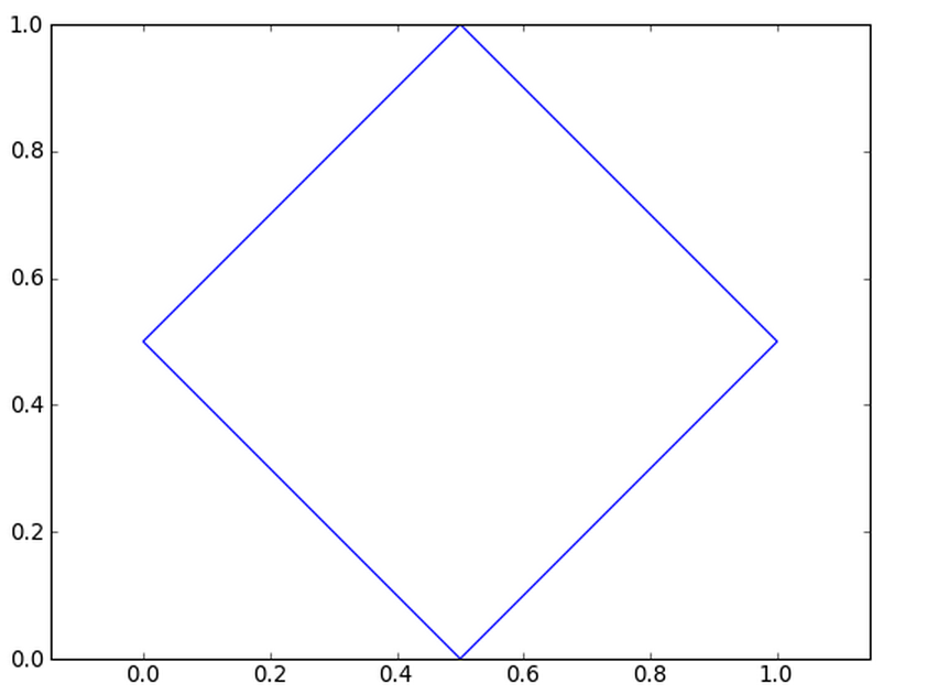
Polyline becomes a polygon when the last point coincides with the first one. For example, let us draw a diamond that consists of the points [0.5, 0], [1, 0.5], [0.5, 1], [0, 0.5]. We will use the command axis(‘equal’) that ensures the same scaling on the x and y axes.
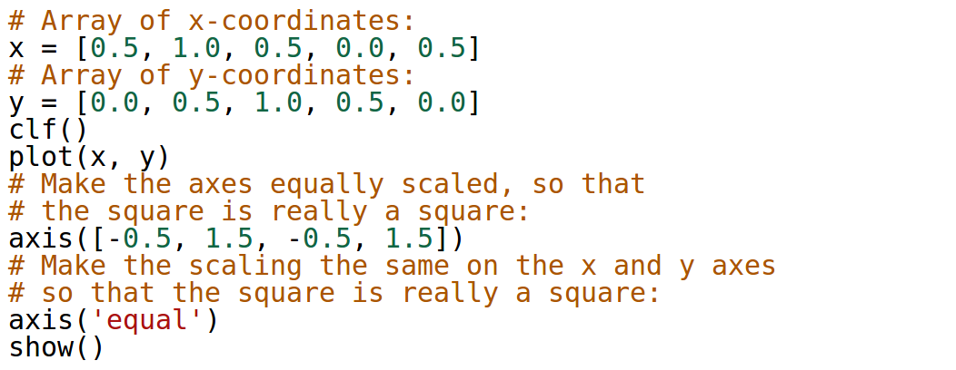
Output:
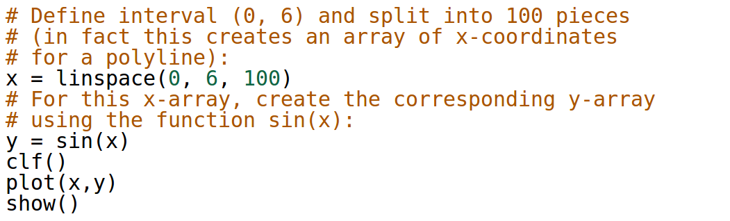
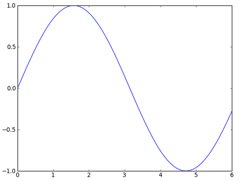
Plotting Functions of One Variable
Let us begin by presenting the shortest possible code that plots sample function sin(x) in the interval (0, 6). The code has five lines, not counting the comments. Notice that the axes are not scaled equally – we could achieve this by using the command axis(‘equal’) if we wanted.
Output:
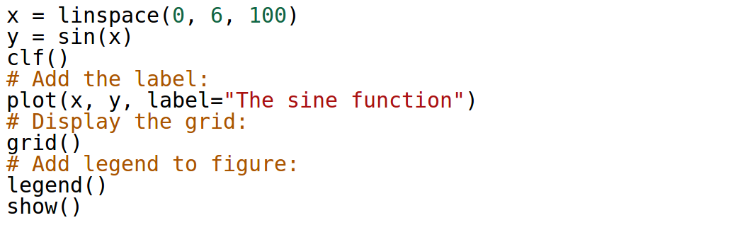
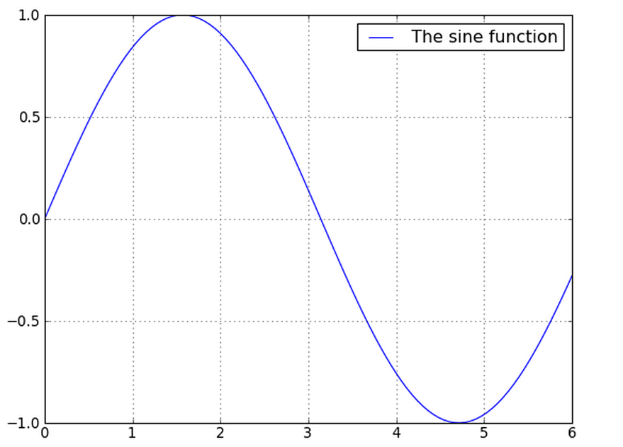
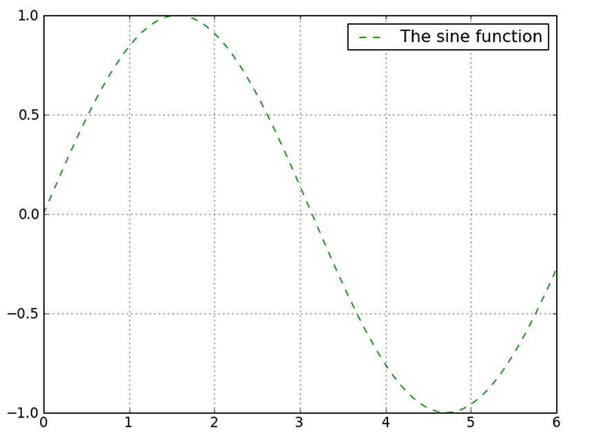
Adding Label and Grid
Let us show how to add (optional) label and grid to the plot.
Output:
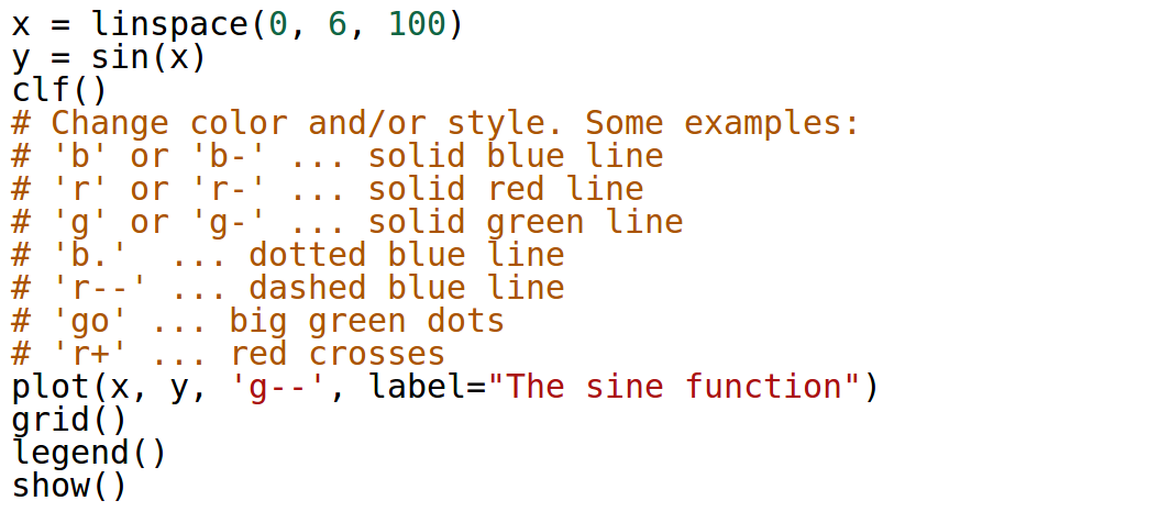
Changing Color and Style
The color and style of the graph can be changed very easily. The style is an additional parameter for the plot() command that consists of one, two or three characters representing the color and/or style:
Output:
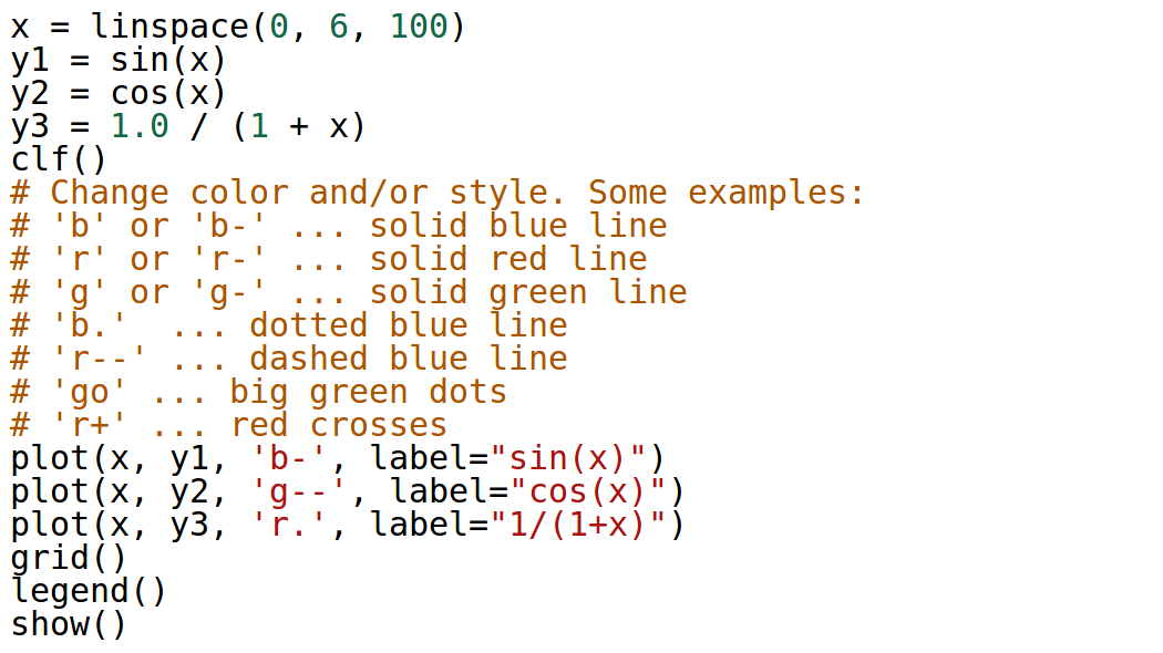
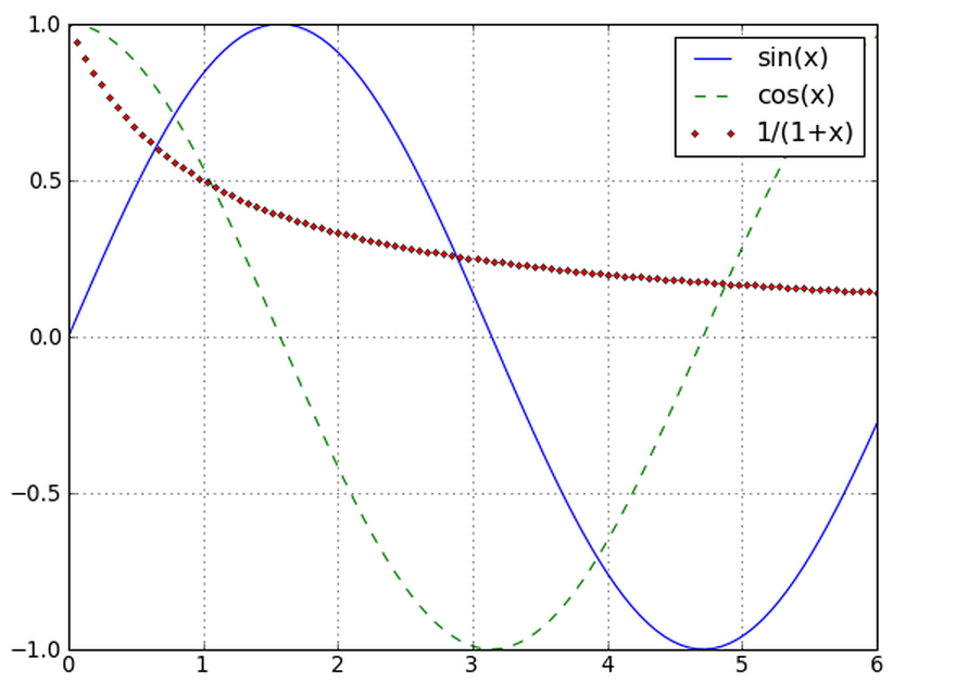
Multiple Graphs in One Plot
This is very simple – just omit the clf() command between the plots and they will appear in the same figure:
Output:
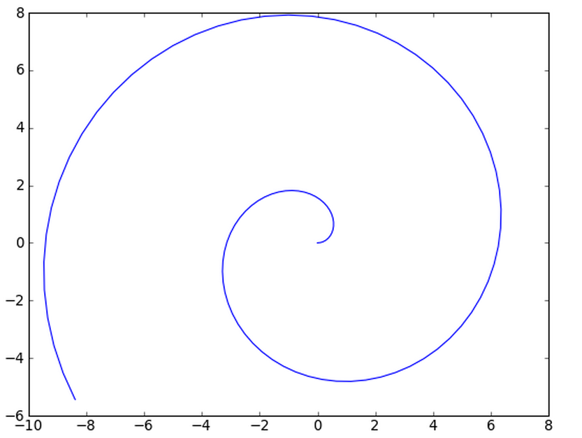
Planar Curves
This is easier than you think. Let’s create, for example, a spiral:
Output:
Functions of Two Variables, Curves in 3D Space, and More
See Chapter 4 (pages 23 – 45) in the NCLab Python Textbook!